This message will disappear after all relevant tasks have been resolved.
Semantic MediaWiki
There are 1 incomplete or pending task to finish installation of Semantic MediaWiki. An administrator or user with sufficient rights can complete it. This should be done before adding new data to avoid inconsistencies.
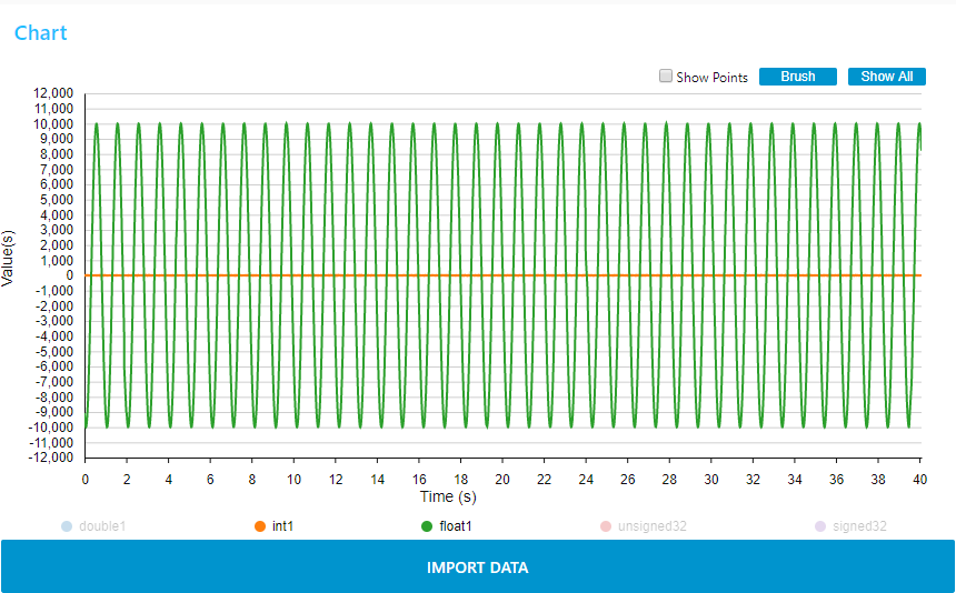
The Chart node is a Node-red node with dashboard widget.
The configuration of the chart (chart type, curve type...) is done by setting the properties of chart node in the design mode. Refer to the information section of the chart node for the configuration parameters details. Please note that the changes are only taken into account after clicking "deploy".
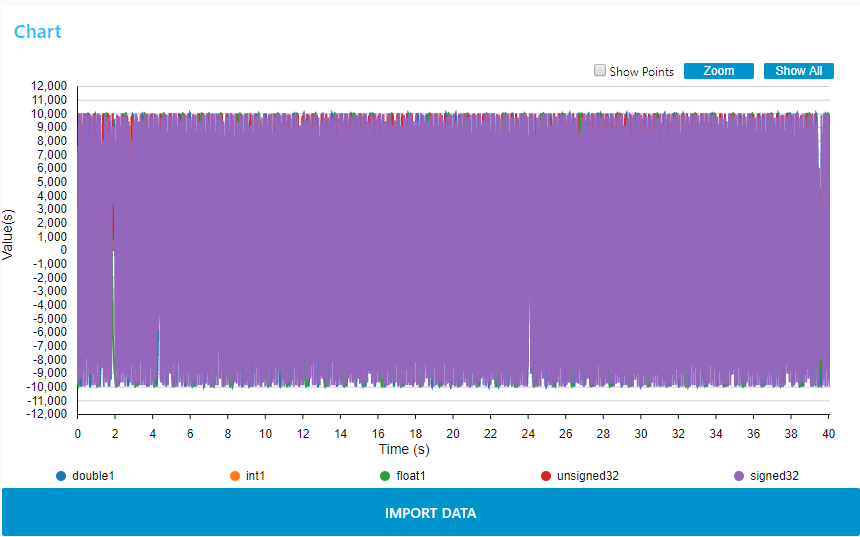
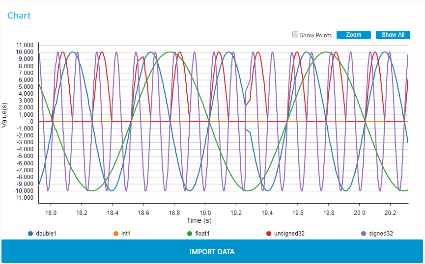
In dashboard side, the measurements appear in line shape or in bar shape according to the chart node configuration.
Line chart:

Bar chart:

Features of the widget:
- Show All button: Allows to render all input values since the beginning of the monitoring session for a line chart or the last input value for a bar chart.

- Zoom / Brush button: Allows to select the Zoom mode or the Brush mode:
- - Brush mode: this is the default mode after deploying the dashboard. And you can switch to Brush mode by clicking on "Brush" button. For the line chart, this mode allows to select one two-dimensional region in order to zoom-in that region. For the bar chart, this mode allows to select one-dimensional region along the y-dimension in order to zoom-in that region. The region selection can be performed by pressing the left mouse button, then brushing the region and finally releasing the left mouse button. As example below, a brush from 18 to 20 second.
- - Zoom mode: A click on "Zoom" button switches to zoom mode. This mode allows to zoom and pan in the chart. Zoom can be performed by spinning the mouse wheel. Pan can be performed by clicking-and-dragging.
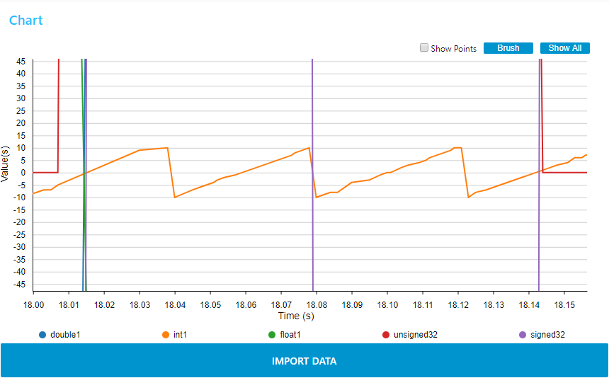
- - Brush mode: this is the default mode after deploying the dashboard. And you can switch to Brush mode by clicking on "Brush" button. For the line chart, this mode allows to select one two-dimensional region in order to zoom-in that region. For the bar chart, this mode allows to select one-dimensional region along the y-dimension in order to zoom-in that region. The region selection can be performed by pressing the left mouse button, then brushing the region and finally releasing the left mouse button. As example below, a brush from 18 to 20 second.


- Show Points check box:
For a line chart, allows to render each input value with a dot. For each variable, dots will be rendered as soon there are less than 200 input values to be displayed. Input values information (variable name, x-value and y-value) are displayed for points whose x value is closest to the mouse pointer. For a bar chart, allows to render each input value(s) above/below bar(s).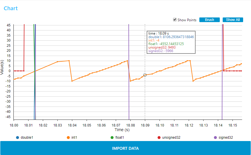

- The legends are clickable to hide or show traces. This feature can be used during measurement.

- IMPORT DATA button allows to reload previous measurement. Report to section "How_to_record_and_replay_data" to activate the log option.

Important: when the message "Acquisition started – waiting for value" appears in top of the chart, this means that monitoring has been launched, but the chart node has received a measurement whose value is null. It happens when using the trigger function, you have to wait for the trigger activation to receive the first valid values. 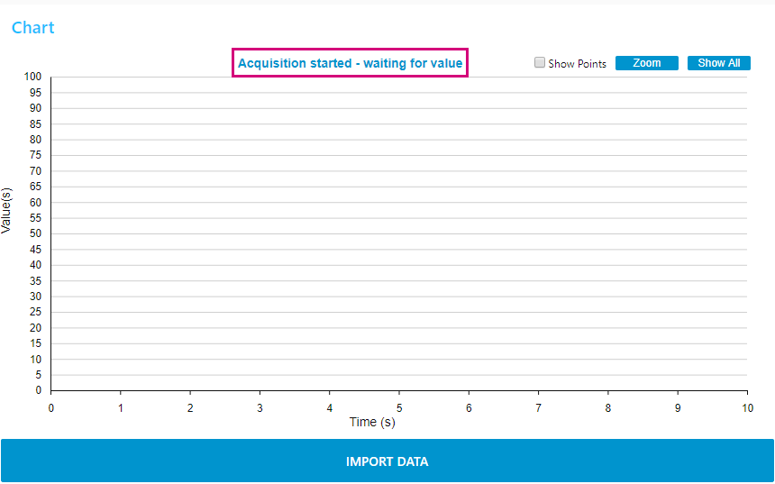 This message remains displayed when the measurement is stopped, it is advisable to clear the graph before starting a new measurement, this will clear the message.
